- Ksoft Technologies, Kerala , India, 679503
- Email: info@ksofttechnologies.com
- Mon-Sat: 9.00am To 6.00pm
KSOFT
A good website is the cornerstone of any business’s online presence. Having a generic website is not enough; an effective business website that boosts conversion rates is essential for success today. A well-designed business site guides clients smoothly through the sales funnel, achieving the ultimate goal of a sale with minimal resistance. Business Consultation plays a crucial role in crafting a strategy that optimizes website performance. Here are 10 effective ways to improve your business website.
Nobody likes to be the first to try out a new product or service. So, by giving testimonials and/or evaluations from previous clients, you may set their minds at ease.
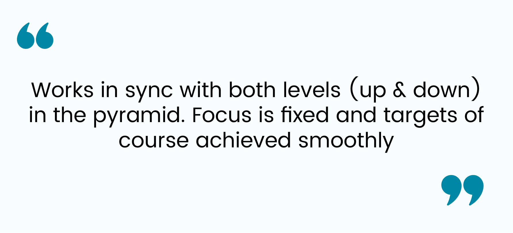
Here’s a customer quote example:

For homepages, you can also add a series of logos that instantly build
trust with new visitors:
Social proof, including testimonials, puts consumers at ease. In an interview with ConversionXL, growth marketing expert Angie Schottmuller said, “If quality social proof buffers notable uncertainty, get ready for some remarkable conversion impact — in some cases up to 400% improvement.”
There’s nothing worse than visiting a website that pulls you in too many directions. Your landing page should be clear, concise, and easy to navigate. If it’s not essential, don’t include it. Stick with what your visitors need to know and nothing else. When possible, implement the following (and not much else):
There are other things to consider – such as a live chat box, social proof, and video (more on these below) – but the point remains the same: eliminate all distractions. You want your visitors to focus on your offer and nothing else.
There’s a psychological principle that humans prefer to finish things that
they start. So, when it comes to your offer on your website, the first step
should be extremely simple to complete.
Instead of asking for an entire
form to be filled out. simply request an email address to start. From there,
you can provide the rest of the form in hopes of securing additional
information. But even if you don’t, you still have the person’s email. The
easier you make the initial step, the greater chance there is of your visitors
taking action and following through to the end.
Alternative logins have become quite popular.
Instead of creating a new
profile from scratch, a user logs in using their Google, Facebook, or other
accounts. This eliminates the signup form altogether.
Mobile responsiveness is critical for a website to be effective. Average
adults spend more than five hours on their mobile phones every day, while more
than one-third do all of their shopping online via mobile device. Needless to
say, your business’s mobile website must offer a positive user experience. If
potential customers land on your site but find it difficult to read or
navigate on a mobile device,
they may simply abandon you in favor of a
competitor. Furthermore, a negative mobile user experience affects your
website in search engine rankings, making it harder for users to find through
a Google search – which brings us to our next point.
Generic CTAs like “Sign up” and “Start trial” won’t give you the best
conversion rates. A few minutes spent improving the copy will give you an easy
conversion rate win. Start with a CTA that starts with the word: “Yes.” It’s
highly effective psychologically because it
paints the offer in a
positive light. Like this:
Try this formula: Yes, I want [your offer]!
It works a lot better
than generic CTA copy.
Dan Veltri, co-founder and chief product officer of Weebly, advises limiting
your top-level navigation menu to five clearly labeled tabs, with related
pages organized under them. You should also offer a clear way to get back to
the homepage no matter where your readers land.
Very often, a Google
search may take your reader to a page on your website other than the homepage.
A study by digital marketing company Akamai found that 88.5% of web users will leave a website if it loads too slowly. Furthermore, the time it takes to load a webpage affects the purchase decisions of nearly 70% of online shoppers. Make sure your website runs smoothly by keeping the software up to date, optimizing videos and images for quicker downloads, and using a website host that can handle your bandwidth demands.
Many visitors want to buy your service but are on the fence. They have a lingering doubt or question that keeps them from taking that last step Live chat tools are perfect for helping these folks. Just like a pop-up, live chat tools are easy to add on any site and have an immediate boost to your versions.
Don’t pay so much attention to your landing page design, copy, and related factors that you overlook the importance of choosing the right offer. This has one of the biggest impacts on conversion rate, as your offer must be appealing to your market. If your conversion rate is on the low-side, cycle through different offers until you find something that clicks with your audience. It may not be the first, second, or even third offer that resonates with your market. But if you continue to experiment and track your results, you’ll eventually find a winner. Start creating the perfect websites for your business right now with these 10 quick tips. Effective websites are tricky at times to create. A lot of work has to be done in order to get it right. The effectiveness of your website can either make or break your business. At Ksoft Technologies we build websites that keep the business owner in mind. Our websites make the lives of our clients easier so that they can focus more on running their business rather than scratching their head over getting the nic-nacs of a business website right. As a software and web development company in Kerala who solely prioritize the results of our clients, we can do the same for you. If you’re thinking about building your business website, you might wanna check our portfolio to make your choice easier.
